Alakazam!
I have previously used AI (specifically, DALL-E) to draw things that I would not otherwise get around to drawing (nor would I be able to at my current level of skill), to take on the task of improving the branding of the dullest of all body washes, and to just generally fool around, philosophize, and even just to illustrate my stories and essays.
(I know—could there be more self-serving links in one paragraph? Probably not.)
Those were all very gratifying ways to use AI art, but in every case the art was intended to accompany or illustrate the written word. What about using AI to generate art for a more visual medium?
I have always loved single-panel cartoons. Sadly, since I stopped drawing at an early age, I never developed my own cartooning style. When I immerse myself in a big book of cartoons, I invariably think of ideas for cartoons of my own, but when I try to execute them I can’t even begin to draw well enough.
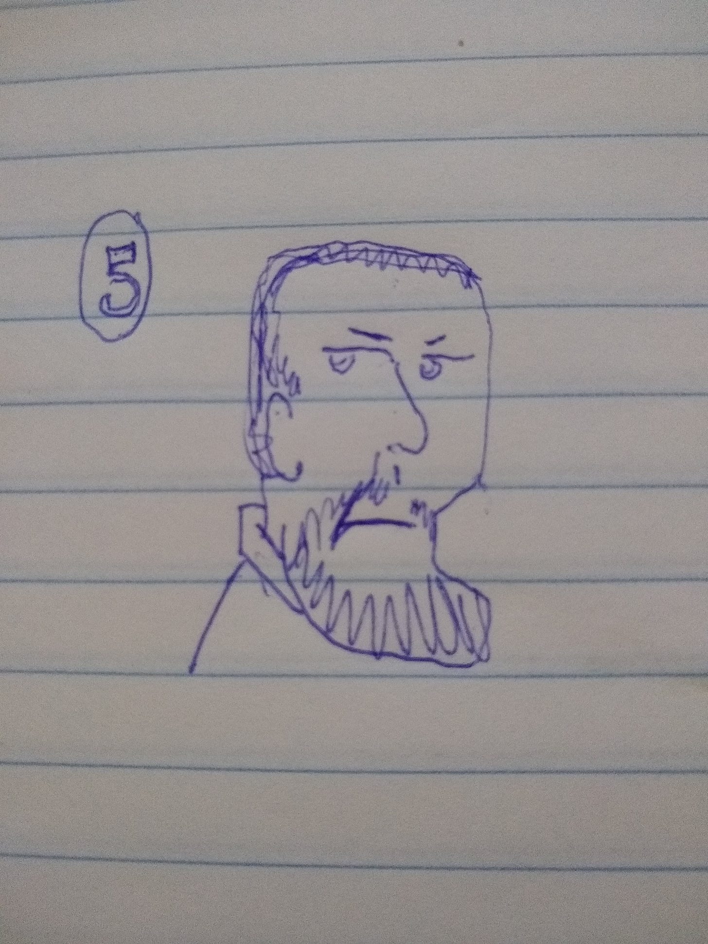
For instance, here’s something I was noodling around with. I don’t remember the exact gag I was going for, but I started off thinking about Abe Lincoln on the five-dollar bill, as one does when casting about for comical visuals:
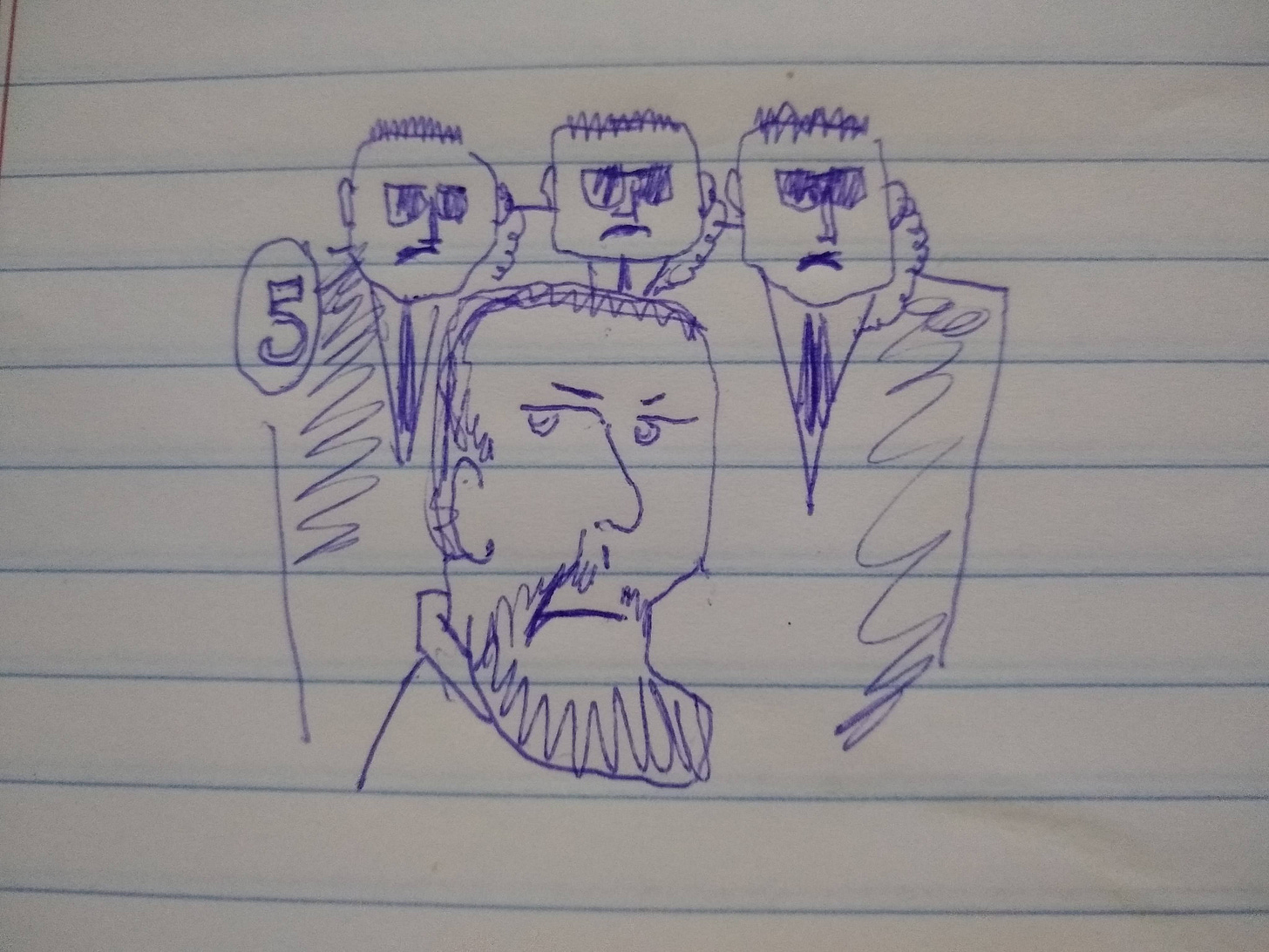
My thoughts then ran to the fact that the Secret Service didn’t exist until after Lincoln was assassinated, at which point it finally occurred to someone that having the president move about unguarded among crowds of possibly angry people was, to quote the raven, nevermore a good idea. So then I imagined the currency with a well-protected Lincoln:
Was there more to this gag? Something like a final drawing that would tell a little story and maybe actually be funny? We’ll never know, because I stopped working on it due to the difficulty of turning thoughts into images.
Fast forward to now, and we have AI to let us do just that! I decided to see if I could come up with a cartoon and get it published in The New Yorker magazine. I know, I know—that’s jumping into the deep end of the pool and inviting failure. But hey, I like to aim high. Besides, choosing a publication with something of a house style lets one focus one’s efforts, and you know how much one likes trying to know one’s market. (I am the “one” in the foregoing exposition, though you could also be one as well.)
I had three swell ideas in short order. Let’s see how they came out.
Elephant Graveyard
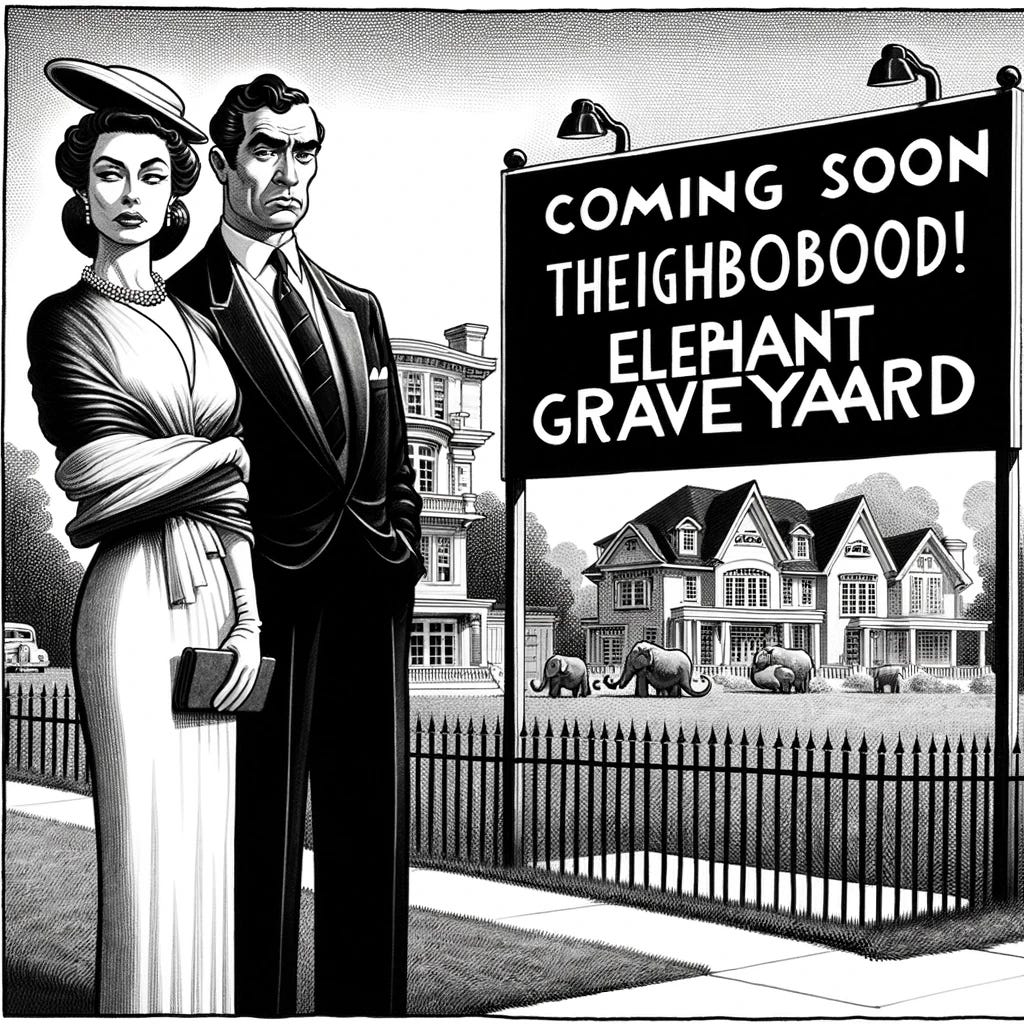
The first idea (sit down, it’s funny) was to show a coupla snooty blue-bloods observing a big sign in their ritzy neighborhood announcing COMING SOON! ELEPHANT GRAVEYARD. It’s already funny, I know, and one can imagine what ol’ Snooty Pants and Snooty Skirt are thinking. Like, ew, an elephant graveyard…here?!? Heavens to Betsy! But my humorist’s instincts told me that explicit sardonic words were needed, so I had one of my snoots saying (brace yourself): “There goes the neighborhood.” Oh, man—that’s gold!
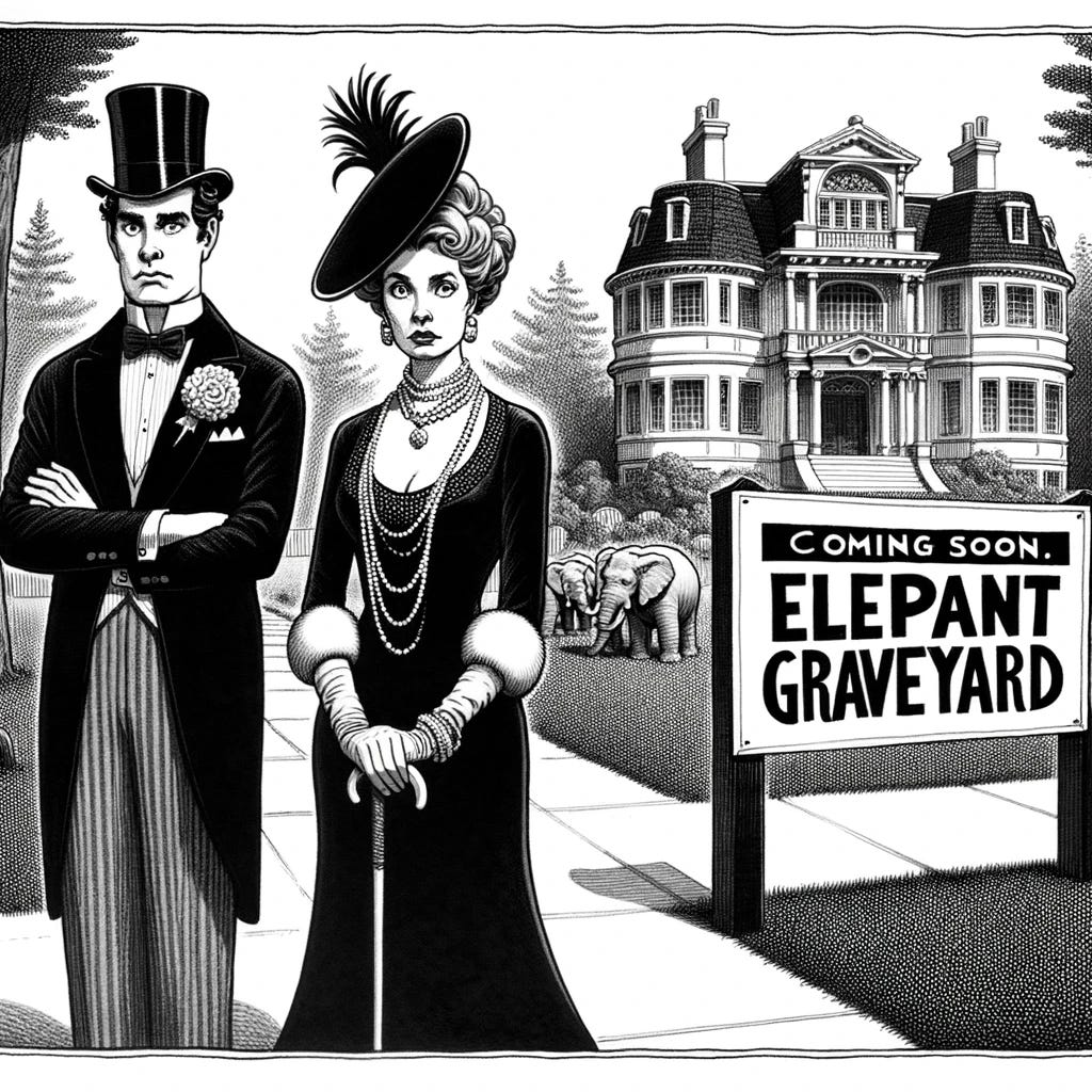
I explained it all to the AI and got this decent first effort:
It’s kinda good, but AI went overboard on dressing up my couple. I wanted them in refined clothes, but not dressed for the Queen’s Jubilee of 1876. Also, I wanted a big, garish sign. And I didn’t ask for any actual elephants. Also, we see the usual problem of AI misspelling things (“Elepant”). Oh, and my requested caption was nowhere in sight.
But hey, that took all of one minute to describe and I’m already in the ballpark. Knowing how fruitless it is, I went ahead and asked the AI to keep everything the same, but remove the elephants, fix the spelling in the sign, and add my caption below the drawing.
Boom (by which I mean “thud”):
First of all, AI never keeps anything the same. It draws it all from scratch. So if you want just one little change, tough luck. It did remove the elephants. It did correct the spelling of “Elephant” but then it went haywire on the word “graveyard”. And a fragment of my caption is now at the top of the billboard. Did I say “billboard”? Yeah, because I asked for a giant, garish billboard, but I kept getting this perfectly discreet little sign. Still, if it had the caption, it would be closer to what I wanted.
Next attempt:
The elephant’s back, peeking over a fence. Still no caption. And they now added the magazine title to the tiny billboard. Spelling improved but still gonzo. I had requested less formal (but still nice) clothing, by which the AI of course knew I meant ditch the man’s top hat but otherwise have them walking around in fancy party clothes.
I became rather insistent, stressing the importance of a properly spelled caption below the drawing:
Theighbobood, indeed.
This is where I usually say *sigh*.
*Sigh*
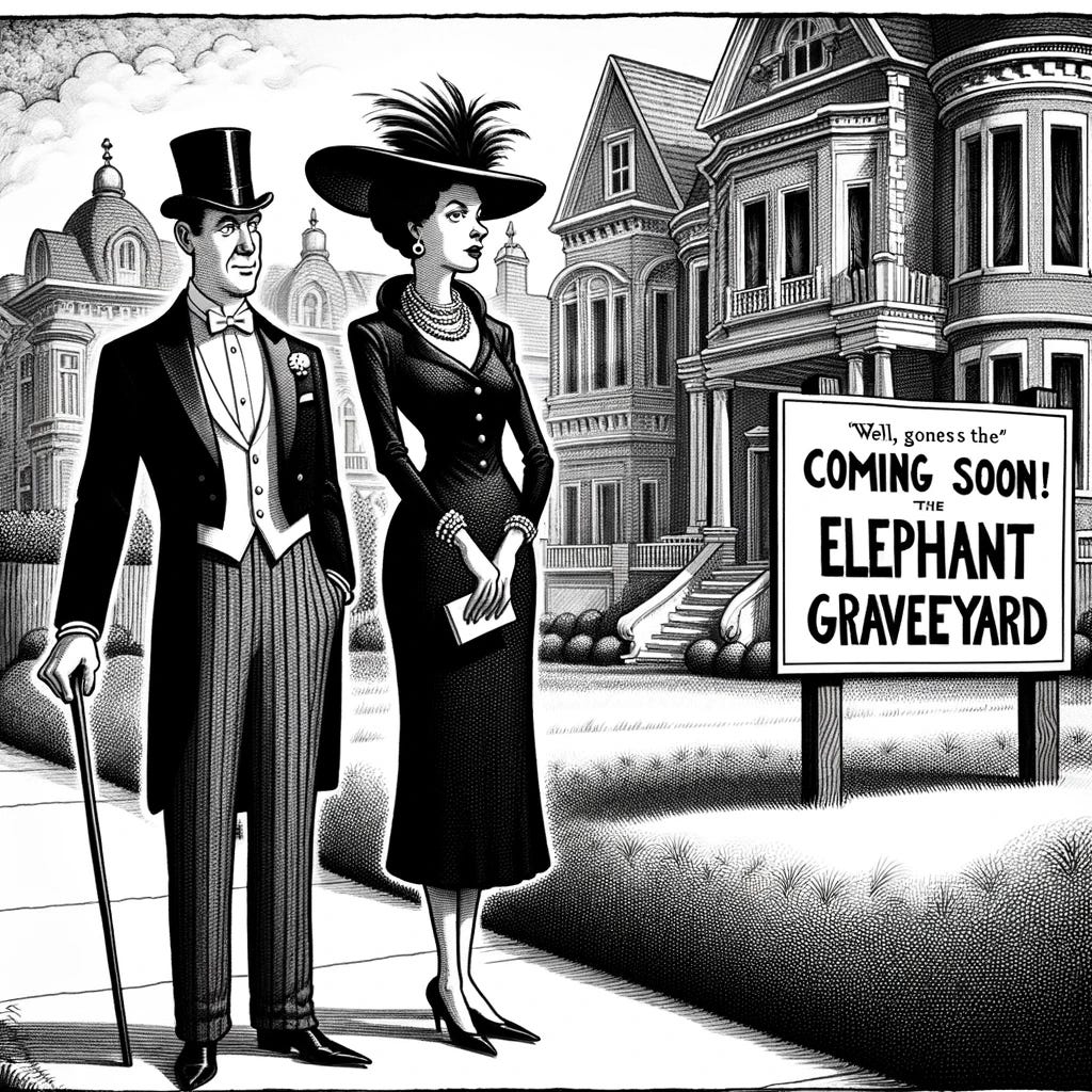
Funny thing about this. Just when you’re ready to give up, the AI relents and gives you most of what you asked for. I made a last-ditch appeal for a caption, and for reasonable clothing for rich folks out walking, and for a less realistic, more cartoonish style, and lo and behold:
Yes! Still with the misspellings, but I like it! I submitted this version and moved on to develop my next great idea.
Canadian Catechism
Sometimes a cartoon just presents an absurd, made-up situation and invites the viewer/reader to see it and laugh. At other times, a cartoon holds a mirror up to society, makes people see themselves as they are, and inspires them to change. And also makes them laugh. And wins a Pulitzer. I know I had just one cartoon under my belt, but already I was ready to step up my game from pure foolishness and into the Societal Change Game.
My target for societal change is the wholly predictable, utterly stewpid repeating of the phrase, “It looks better from the Canadian side,” whenever someone mentions Niagara Falls. For one thing, that’s your opinion, man; for another thing—is it really your opinion, or are you just repeating what someone else told you?
I have grounds for asking that last question. I went to Niagara Falls in 2013. I loved everything about it, in spite of seeing it only from the American side. I thought I would enjoy telling friends about the experience, but I was denied any such pleasure. My every mention of the place was swiftly met with, “You know, it looks better from the Canadian side.”
“Perhaps,” I would reply, “but we found ourselves able to observe the nests, eggs and chicks of water fowl—”
“Canadian side’s better!”
“—birds, I say, and everyone treated them with respect while touring the falls, and then we—”
“Canadian side! Canadian side! Canadian side!”
End scene.
The first few times, I was dumbstruck. But then I devised a cutting response: “So I hear. Where did you stay when you were in Canada?”
Guess what? None of my interlocutors (or interlocutees, I guess) had ever actually been to Canada! They just thought the best thing to say was not, “Cool, tell me about your actual experience,” but to spit some blather they heard second, third, fourth, or fifteenth hand from the friend of a cousin of a former roommate.
Breathe, Chris…breathe.
OK. I’m all right. But this calls for a Pulitzer-worthy, mind-altering New Yorker cartoon.
Do you think it’s too much?
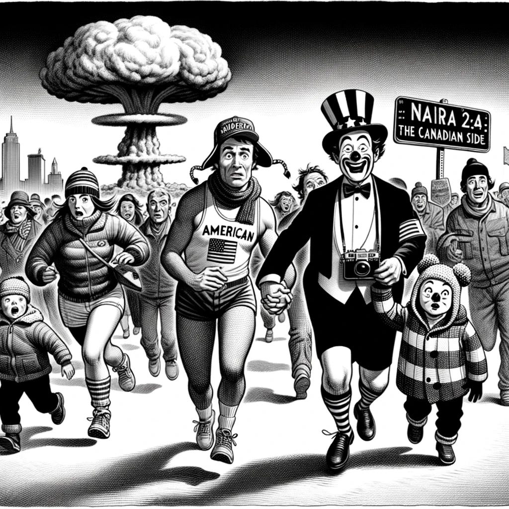
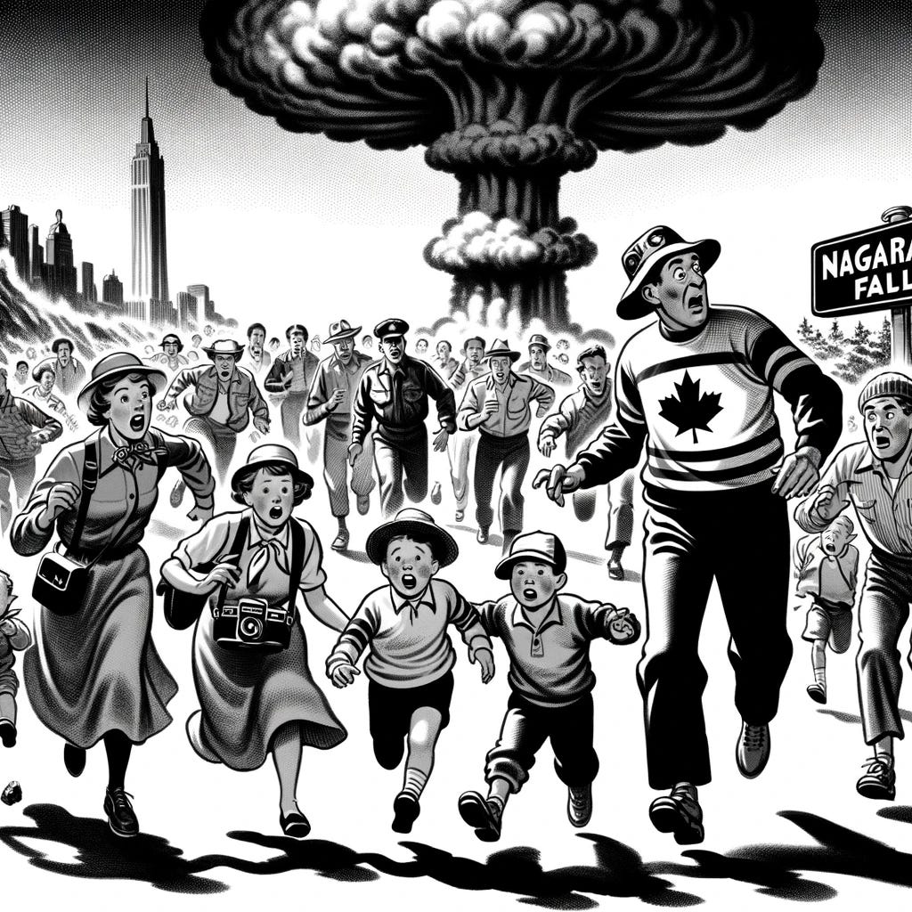
Yes, I did request an atomic mushroom cloud in close proximity to Niagara falls. And yes, I did request a crowd of panicked people running from it on the American side. And I did ask it to make a foreground character identifiably American. And I did ask for a Canadian person wearing a hat with characteristic Canadian earflaps. But the specific arrangement of the family so they are not running together, and the American looking like a clown, and the Canadian wearing Daisy Dukes or an Olympic track outfit—that’s all our perverse AI friend misinterpreting my clear instructions.
Oh, and my requested caption of “Stop! It looks better from the Canadian side!” was once again sliced and diced and a mere fragment was inserted into the drawing itself.
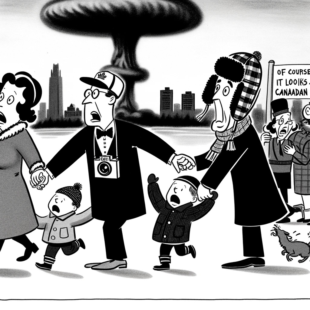
Reboot, please, and make it more cartoonish and get rid of the bizarre things:
Well now. I love the style. But I lost the panicked horde, and the helpful Canadian is still holding hands with the American dad (in a tuxedo, for God’s sake). There’s a half-assed attempt at my caption off to the right. Oh, and it is not obvious that Niagara is in any way involved. The nuke appears to be hitting a large city.
Ask for corrections and try again:
Absolutely better in some ways, but now there’s no people other than my family. Canada Guy is now in a tux and has clown makeup (why?). And even if I were to add my caption, there’s no character in the thing who is obviously delivering the sage (stewpid) advice.
Again.
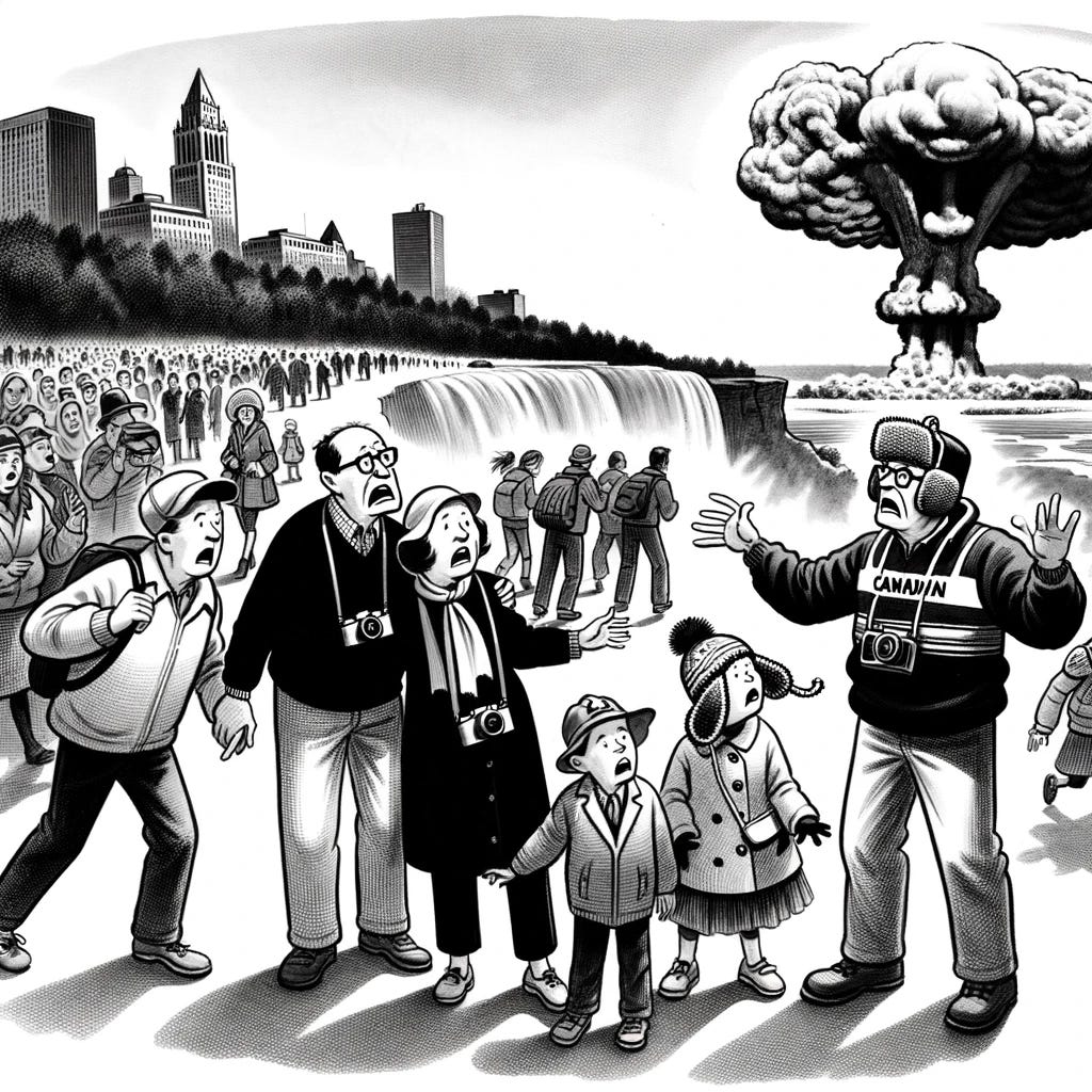
Fantastic! Love the style! The only flaw is that my American family now lacks the dad. And I really, really wanted the helpful Canadian guy to obviously be shouting his advice directly at the foreground American family. But I do love the style of art—very 1950’s.
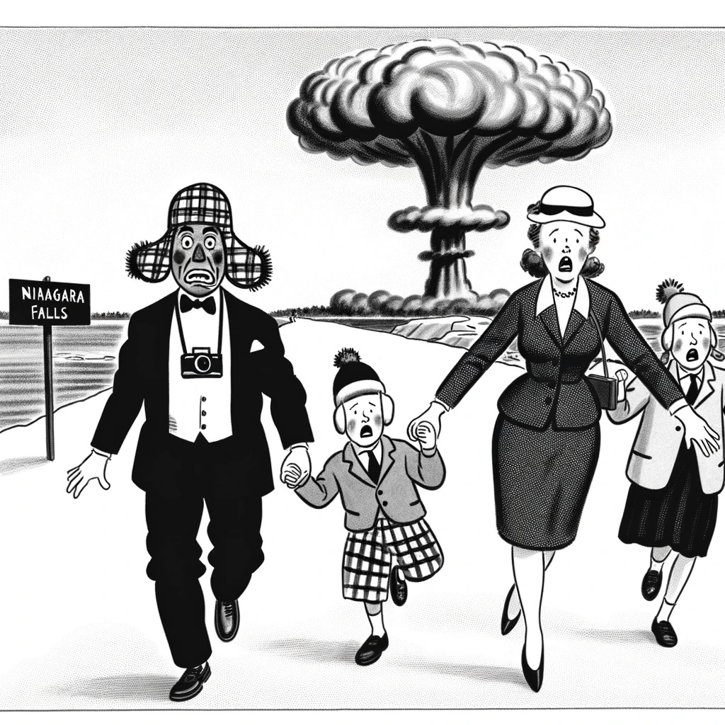
Try again, with corrections:
Finally. Perfect in almost every way, except for the mushroom cloud being shaped like a clown head. I had to supply the caption myself, but that’s OK given the near-perfection of the drawing itself. My vision achieved and my hopes for effecting societal change like, totally stoked, I submitted this version.
By the way, I couldn’t resist asking for one more version, this time with my favorite slobbery cartoon giraffe:
On to the next gag!
A Snarky Rich Lad
In the retelling, I make it seem like I developed all of these cartoons in one sitting. That’s near enough to the truth for the first two. And in fact, that’s all the ideas I had, at first. My third cartoon came along only after the first two were rejected by The New Yorker.
I must say, they respond fairly promptly, at least with rejections. Their submission guidelines lead you to think it might take months and months to hear from them. Maybe that’s true only if you make it past the first cut. My rejections came along right quickly. The rejections are worded like this:
Standard boilerplate rejection letter. But you know, I kind of resent the implication of that last sentence about getting a better idea of the material we publish. Because you know what? I’ve been getting that idea for along about 50 years now! Do you think I opened the magazine one time, declared, “I can do that,” and set about cartooning? If I did, I would have rejections dated 1975.
Look, I would rather hear, “This is not good enough,” than, “Dear reader, maybe spend some time studying what we do publish, m’kay?”
So it was with a perhaps somewhat jaundiced frame of mind that I resolved to give them what they do publish in large quantities, which is, of course, elitist snark. And the best way to convey that is, of course, to draw an elitist person saying something snarky.
The great thing about elitist snark is that the drawing is not a huge challenge. Few if any moving parts, probably an interior setting with high-end furnishings, people in suits flapping they gums. Really, they could have the same drawing over and over, and all you need is a new caption every week.
So, let’s have at it, not even asking for a caption, just getting the scene right:
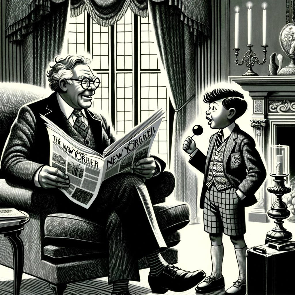
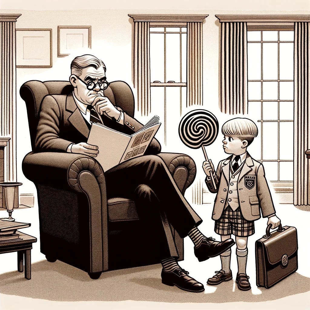
No. I asked for a dad, not a grandpa. And I didn’t ask that he be reading a newsprint version of The New Yorker. Also, the dad/grandpa looks too much like Warren Buffett. More cartoonish, please.
Close. Very, very close. The lamp, unfortunately, took on the aspect of the large lollipop that I requested for the boy. But this version would do if I couldn’t improve upon it. I asked for a looser, more obviously hand-drawn style.
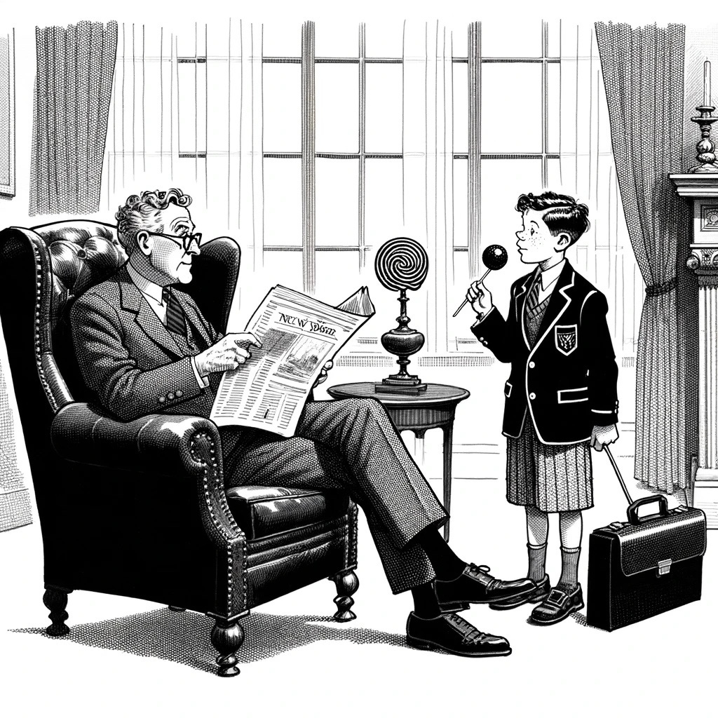
Nope. Still too architectural. And the kid needs to be just a bit older, and he needs to be speaking. Fair effort, though. Next I re-emphasized the wish for a hand-drawn style, and even specified that it look more like a charcoal rendering.

We have a winner! The trappings of wealth and privilege are obvious even without a detailed rendering of the entire room. The kid’s casual, near-adult pose is just what I wanted.
Is the caption funny? Well, not so much to me, but I’m not a fan of snark. I’m also not a fan of in-your-face disrespect for one’s elders. According to the Bizarro Universe Theory, then, this thing that doesn’t strike me as funny ought to really kill ‘em up Manhattan way.
The fact that this post is in “Blobs of Stuff” and not in “Published Works” probably tells you that this cartoon, too, was rejected. There is no profit in noticing the timing of the rejection, but this one took well over a month to get a rejection, where the others took not more than two weeks. Does that mean that it made it past the first cut, what with its snarky, elitist payload? I don’t know.
All my self-serving bitching aside, The New Yorker publishes a lot of great cartoons, and maybe someday my pal AI and I will create a winner.
Boing!


